Is the Red Rooster Line True?
As I was driving a friend home one day he mentioned to me that he lived just on the wrong side of the Red Rooster line. Curious, I had to ask – “what is the Red Rooster Line”? He mentioned to me that if you drew a line between the easternmost Red Rooster stores in New South Wales it was an indicator of your socio-economic status. This seemed like such a strange phenomenon. Surely Red Rooster didn’t intend to place their stores in such a manner? So I collected the locations of all Red Rooster stores in NSW and used a program to draw a line connecting the easternmost points.
Comparison with Actual Statistics
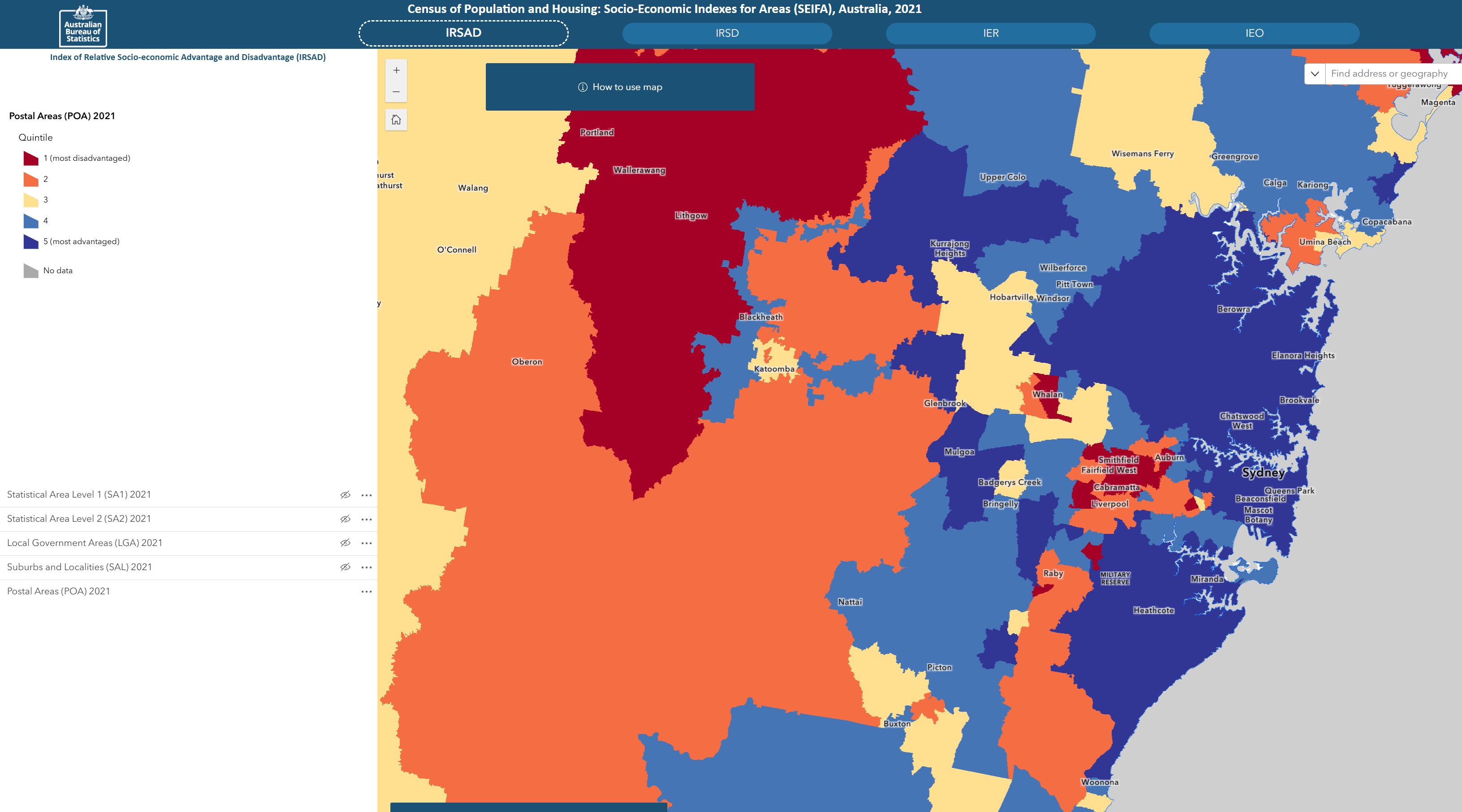
The Australian Bureau of Statistics (ABS) has information on the distribution of Index of Relative Socio-economic Disadvantage (IRSD) SEIFA scores, albeit from 2021. I used their map function to visualize the lowest socio-economic areas (dark red) compared to more affluent areas (dark blue). Click the image to view the data source.
Recreating ABS Socio-Economic Map and Superimposing Red Rooster Line
The only way for me to truly see if the Red Rooster line reflected the Socio-Economic status areas was for me to download the ABS raw data and recreate the heat map. Once this was created, I then superimposed the Red Rooster line on top of it. If you zoom in you can see that there are still many suburbs considered affluent but are West of the line. There is a Red Rooster at the Airport and I’m not sure if this should be included or not? Nevertheless, the Red Rooster line doesn’t appear to be the definitive divider of socio-economic status. A few of these stores may need to close in order to maintain its reputation!